Before You Order - Picture Mount - Choose Width
Wide mounts can make subjects look even more impressive.
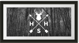
This is because wide mounts can emphasize the subject creating a presentation like those you’d see in a gallery. On small subjects, wide mounts give the impression of value and importance.
On large subjects, a wide mount can maintain the balance of the subject, keeping everything proportional.
If you’re double mounting, using one mount underneath another – Main & Base
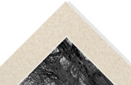
Avoid ‘striping’ this is caused when double mounts are the same width.
Just make the “BASE”, the part nearest to the artwork, no smaller than 5mm, 7mm is recommended, although some subjects may demand more. 10mm should be the absolute maximum.
If you’re using Multiframe (Framing more than one image / picture)
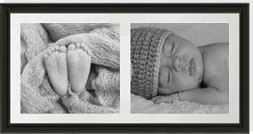
Again avoid ‘striping’ when selecting the central border. This should always be smaller than the main mount widths. 60% of the main mount down to a minimum of 20mm is a good guide.
If you’re selecting a main mount width of 40mm, a 24mm central border will be in proportion. 15mm should be the absolute smallest to select.
Consider “weighting” the mount by distributing the size.
Sometimes, artwork needs a lift. If you are framing an extra large, or very long piece, or if the focal point of the piece happens to be near the bottom, consider “weighting” the mount by making the mount bottom heavy. In other words, when entering the mount border widths, have it a little wider on the bottom than on the top and sides. This gives a feeling of support for the heavy piece, makes it more balanced and easier on the eyes. Another way that you can apply this technique is to have the mount widths smaller on the left and right.
The more you weight the mounts, the more dramatic, the narrower, and more subtle.
Use MOUNT DESIGNER to “Weight” your mounts.
How to decide the colour of a mount
Light, dark or neutral?
Different colours change the look of your picture / image in different ways.
For example, a dark mount can control your subject while a light mount will amplify it.
Light coloured mounts can open up a subject and make it appear larger.
Dark coloured mounts can turn you eye inward, making the picture seem smaller.
Black and white images look great with white.
Neutral colours, like Ivory and White are always great choices, as they fit right into any room.
Should the mount colour complement where it is to be displayed or the subject?
Both are important but you should really match the mount to the subject first as the subject will never change and the decor inevitably will! When choosing a mount colour, go no lighter than the lightest colour within the subject, no darker than the darkest and no brighter than the brightest. This will guarantee success.


